

A master chart is a single, configurable visualization that pulls one or more data sources into a reusable dashboard. It matters because it replaces a folder of one-off charts with one source of truth you rebuild once and reload forever. Your next step: map your primary metric and set a time range.
Quick-start checklist:
- Pick your data source (spreadsheet, connector, or manual entry).
- Map the timestamp field and your main metric.
- Choose a chart type and scale.
- Save it as a preset before you touch anything else.
Skip the checklist and you'll rebuild the same chart three times this month. Save it once, and you won't.
Key Takeaways
A master chart works because it standardizes your data mapping, scale, and layers once, then lets you reload that same configuration indefinitely instead of rebuilding from scratch.
| Point | Details |
|---|---|
| Define before building | A master chart is a reusable, configurable dashboard, not a single static image. |
| Map fields correctly first | Timestamp, metric, and grouping keys must be set before chart type or scale. |
| Match chart type to the story | Waterfall for bridges, line for trend, scatterplot for correlation, no universal default. |
| Save presets completely | Store scale, time range, and layers together, not just the visual output. |
| Pair with prebuilt overlays | Scalping-Algo's indicator suite adds signal overlays and webhook alerts to a chart you've already mapped correctly. |
Table of Contents
- What Is a Master Chart and When Should You Use One?
- How Do You Build Your First Master Chart?
- How Do You Manage Multiple Master Charts?
- What Customization Options Change How a Master Chart Reads?
- Which Chart Types Actually Communicate Clearly?
- Two Master Chart Workflows You Can Copy
- Why Do Master Charts Break, and How Do You Fix Them Fast?
- How Traders Pair a Master Chart with a Live Trading Dashboard
- Where a Trading Dashboard Fits Alongside Your Master Chart
- Sources
What Is a Master Chart and When Should You Use One?
Think of a master chart less as "one big chart" and more as your dashboard's control panel. Instead of building a fresh line chart every time someone asks for updated numbers, you configure it once, with defined metrics, scale, and layers, and reload it with new data whenever you need it.
The payoff shows up fast:
- One source of truth. Everyone on the team looks at the same numbers, formatted the same way.
- Reusable presets. Build the scale, time range, and annotations once, use them on next quarter's data without re-deriving anything.
- Faster reviews. A saved preset turns a 20-minute chart rebuild into a 20-second refresh.
You'll reach for a master chart most often for financial analysis (revenue bridges, waterfall breakdowns), KPI monitoring across a team or product line, and side-by-side comparisons across instruments or accounts.
How Do You Build Your First Master Chart?
Start small. A working master chart beats a perfect one that never ships.
- Choose your data source. Spreadsheet upload works for quick, one-time analysis. A live connector fits recurring reports you'll refresh weekly. Manual entry is fine for small, slow-moving datasets like monthly account summaries.
- Map your fields. Identify your timestamp column, your primary metric, and any grouping keys (account, ticker, department). If you're tracking daily P&L across three accounts, your grouping key is the account ID, not the date.
- Build and save. Pick an initial chart type, set your time range, and lock in a scale. Then save the whole configuration as a preset, not just the chart image.
Before you map anything, clean the data:
- Normalize dates to one format. Mixed formats are the single most common reason a master chart breaks on refresh.
- Decide how you'll handle missing values. Zero, blank, or the last known value all read differently on a chart.
- Align series frequency. Don't plot daily data against a monthly series without resampling one of them first.
Watch for two recurring mistakes: mapping the wrong column as your time key (common when a spreadsheet has both a "created date" and an "updated date"), and mixing units, like plotting percentages against raw dollar values on the same axis.
Pro Tip: Save your preset before you add a single annotation or color tweak. Presets saved mid-edit tend to carry over half-finished formatting that's a pain to undo later.
How Do You Manage Multiple Master Charts?
Once you've built two or three, organization stops being optional. Most platforms let you add, rename, reorder, and delete charts from a central management panel, and treating that panel like a junk drawer catches up with you fast.
Keep it clean with a short routine:
- Name charts by function and frequency, not by date ("Weekly Revenue Bridge," not "Chart 4").
- Reorder so your most-referenced charts sit at the top, not buried on page three.
- Delete stale charts quarterly. A dashboard with 40 charts and five active ones helps nobody.
- Set permissions deliberately. Editors should be able to remap fields; viewers should only see the rendered chart.
A predictable naming scheme and refresh cadence keep teams from misreading stale data as current.
Pro Tip: Add a one-line version note every time you change a preset's scale or data source. Six months from now, you'll thank yourself for not having to guess why the numbers shifted.
What Customization Options Change How a Master Chart Reads?
The same dataset can tell three different stories depending on how you configure the chart around it. That's not a bug. It's the whole reason customization options exist.
Start with your metric selection. Grouping related metrics (say, gross margin and operating margin together) makes patterns visible that get lost if you plot ten unrelated lines on one axis.
Time-frame controls matter just as much. Most master-chart tools offer quick presets alongside custom calendar ranges, from a trailing six months to a full multi-year view. Use quick ranges for routine check-ins; switch to custom ranges when you're isolating a specific event, like a product launch or earnings call.
Scale choice changes the story more than most people expect:
- Linear for absolute values where the raw numbers matter.
- Logarithmic for data that spans several orders of magnitude, like market cap comparisons.
- Percent for normalizing series with different starting points.
- Percent-off-high for tracking drawdowns against a peak, a staple in financial-analysis dashboards.
Layer in moving averages, medians, or benchmark lines to add context, but preserve exactly what made the chart work when you save the preset, including scale, layers, and annotations, so the next analyst doesn't have to reverse-engineer your setup.
Which Chart Types Actually Communicate Clearly?
There's no single universal chart that fits every dataset. Effective charting means matching the visualization to the data's narrative, not defaulting to whatever chart type your tool opens with.
- Line charts show trend over time. Use them for anything continuous, like price or revenue movement.
- Bar charts compare discrete categories, quarter over quarter or account over account.
- Waterfall charts show additive and subtractive contributions in sequence, the standard for revenue-to-earnings bridges.
- Scatterplots reveal correlation between two variables.
- Treemaps show proportional breakdowns within a hierarchy, useful for portfolio allocation.
- Conversion funnels track drop-off across sequential stages.
On design: keep your color palette to three or four meaningful shades, label axes in plain language, and annotate the one or two points that actually matter instead of cluttering the chart with every data point available. Check contrast for readers with color vision deficiency, and keep text large enough to survive a screen share.
Pro Tip: Pair a line chart with a waterfall for layered storytelling. Show the trend first, then break down what actually drove the change.
Two Master Chart Workflows You Can Copy
Financial analysis: Build a revenue-to-earnings bridge with a waterfall chart and a percent-off-high scale if you're also tracking drawdown from a peak. Add gross margin and operating expense as separate layers. Save the preset with the fiscal quarter's date range locked in, so next quarter you swap the data and keep everything else.

Operational dashboard: Group related KPIs (signups, activation rate, churn) into one master chart with toggles so lines don't overlap. Set alert rules on the metrics that matter most, then name the preset by cadence, "Weekly Ops KPI," not by the date you built it, so your team finds it without searching.
Both examples share one habit: decide what belongs in the preset (time range, scale, layers) before you build, not after.
Why Do Master Charts Break, and How Do You Fix Them Fast?
Most master chart problems trace back to one of four things:
- Missing data after a refresh usually means a broken connector, not a data problem. Re-check the source connection first.
- Date misalignment happens when two series use different date formats. Normalize both before remapping.
- Unit mismatches (percent vs. raw dollars) distort scale. Check your axis units before you assume the chart is lying to you.
- Overlapping series get unreadable fast. Switch to a normalized or percent scale, or split into grouped subplots.
If a chart looks flat when you know the underlying trend isn't, test a logarithmic or percent-off-high scale before concluding the data's wrong. When in doubt, clear the cache and re-import. If the issue persists after that, it's a mapping problem worth escalating.
How Traders Pair a Master Chart with a Live Trading Dashboard
Here's a workflow that shows up constantly among active scalpers: capture raw price and volume data, map it into a master chart with your key metric and time range set, then layer indicator overlays on top for confluence.
- Capture raw OHLCV data from your exchange or broker feed.
- Map it into your master chart, timestamp as the time key, price as the primary metric.
- Overlay signal indicators for entries and exits.
- Alert through a webhook tied to that preset, routed to Discord for real-time monitoring.
- Review the session against your backtest data before the next trading day.
A preset that pushes alerts straight to Discord turns a chart you'd otherwise babysit into something that taps you on the shoulder only when it matters.
Trading carries real risk of loss, and no indicator or chart setup removes that. Backtest before you trust a signal live, and review your master chart's historical performance regularly, not just when something goes wrong by applying trading performance tracking methods designed for multi-account setups.
A Pragmatic Note on Chart Complexity
Two things I've learned reviewing chart setups: default settings almost never fit your actual question, and most over-engineered charts fail because the builder forgot who has to read them. Add complexity only when a specific decision needs it. Otherwise, keep the simplest version that still tells the truth.

Where a Trading Dashboard Fits Alongside Your Master Chart
Everything above works whether you're building charts by hand in a spreadsheet tool or inside a dedicated platform. But if you're trading lower timeframes and want prebuilt overlays instead of coding your own signal logic from scratch, that's a different piece of the workflow. Scalping-Algo's indicator suite pairs real-time, non-repainting signals with a Command Center dashboard that handles alerts and backtesting in one place, so your master chart setup connects straight to execution instead of sitting in a separate tab.
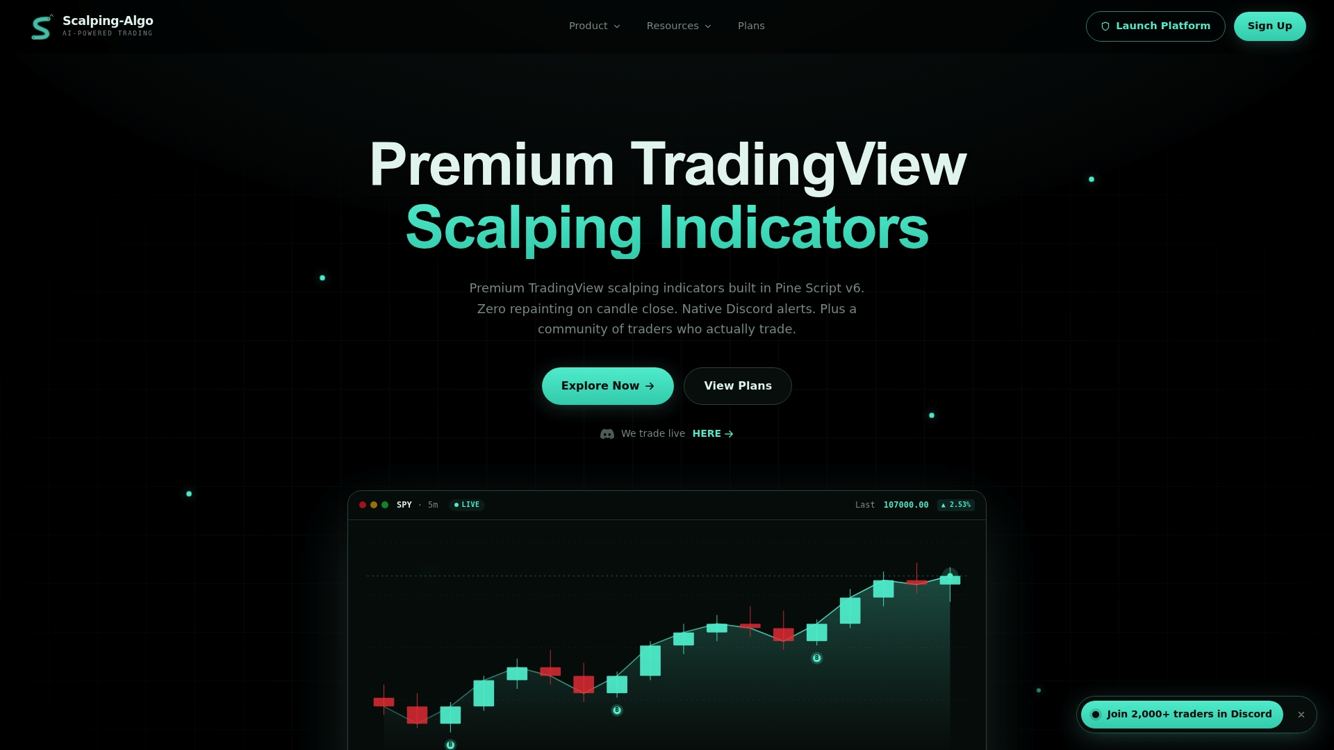
The Algo Master 3-indicator system gives you confluence tools and volatility gating already built, which cuts a lot of the manual overlay work covered in the customization section above. You'll still want to understand mapping, scale, and time-frame choices, since a prebuilt indicator only works well on a chart that's configured correctly underneath it. If you're ready to see how the signals map onto a live chart, check the indicator suite and start with a free look at how the dashboard handles alerts and backtesting.